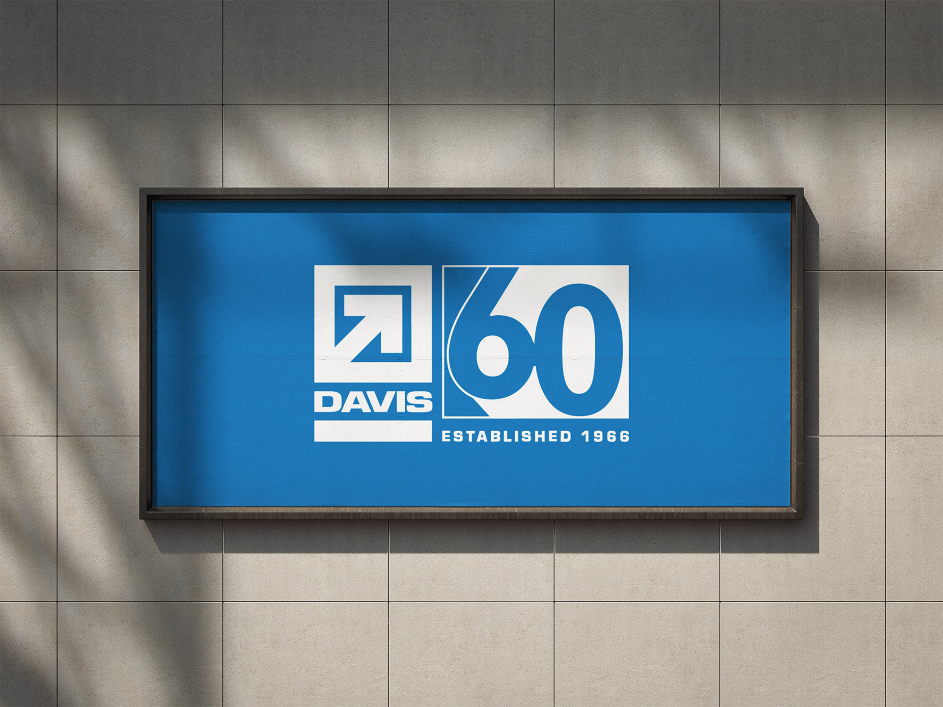
DAVIS CONSTRUCTION
60TH ANNIVERSARY IDENTITY 2026
Overview
Client --------------------->
Role ------------------------->
Year ------------------------->
Scope ---------------------->
project type ---->
Contribution ----->
Davis Construction
Brand Designer
2025 - 2026
Identity / Campaign
Client Project
Identity development, Visual direction, System development, Applications, Guidelines
challenge
DAVIS Construction was approaching its 60th anniversary and needed an identity that recognized the company's history while positioning the brand for its next chapter. The challenge was to create something still recognizable as DAVIS in the DMV area, as well as new areas of operation, while also giving the anniversary its own visual presence.
design direction
DAVIS Construction needed an anniversary identity that celebrated its history without becoming disconnected from the established brand. The direction focused on extending recognizable brand elements into a contemporary visual system.
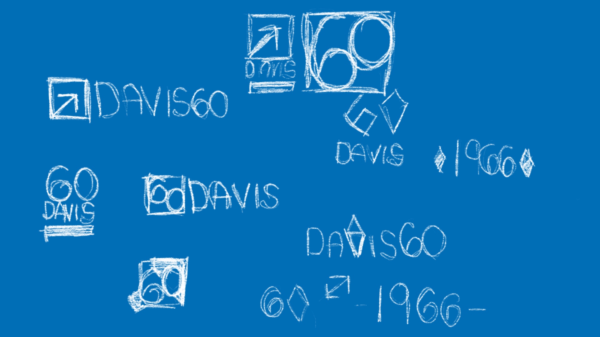
Brand recognition
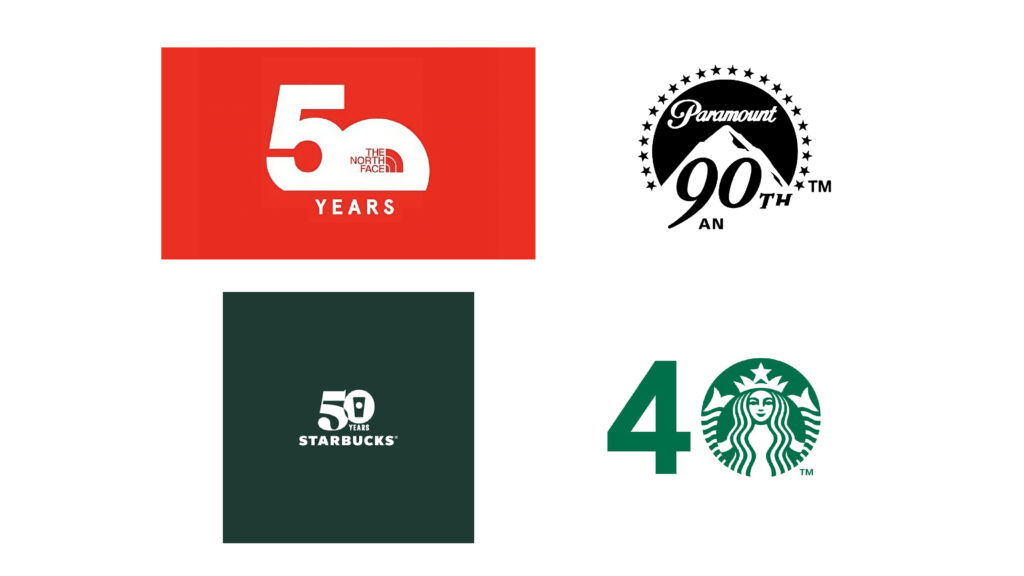
DAVIS has built strong brand recognition over more than 60 years, particularly throughout the DMV region. Preserving that equity was an important consideration in developing the anniversary identity. Rather than replacing the established DAVIS typemark, the direction explored ways to extend it with an anniversary element that could feel new while remaining immediately recognizable to existing clients.
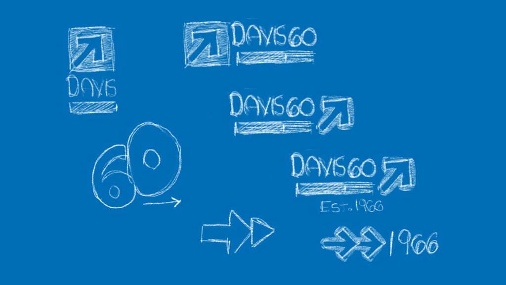
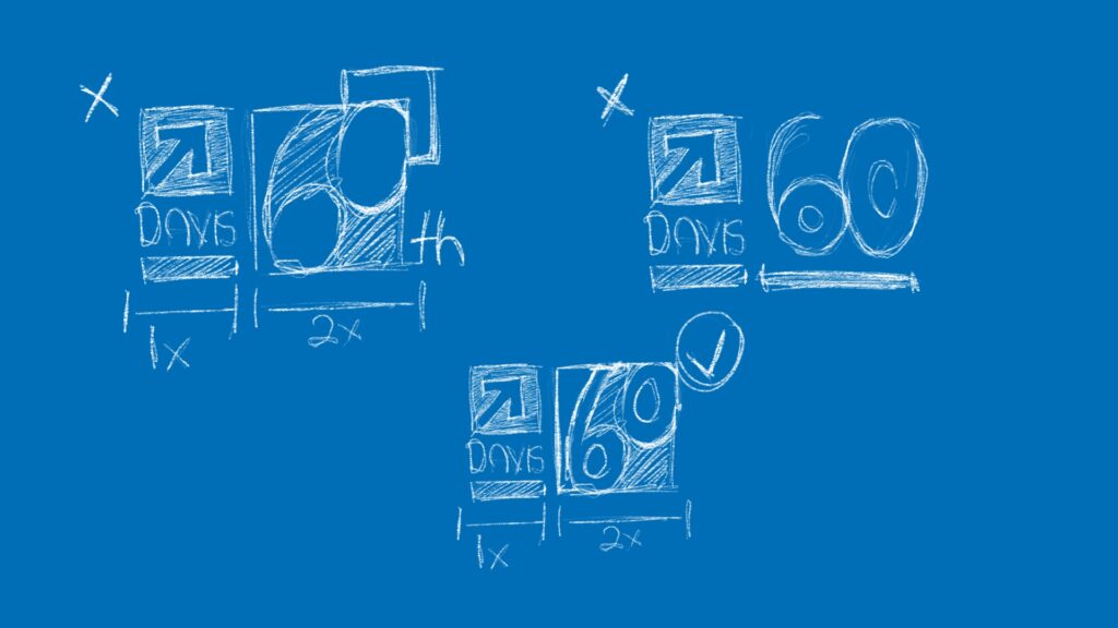
built around 60
The "60" element became the central device of the anniversary identity, allowing DAVIS to maintain recognition with existing clients while pushing the typemark in a direction that celebrates the company's history. Special attention was given to retaining the established DAVIS typemark within the 60th anniversary mark as the company expanded into new geographic markets. The guiding philosophy throughout the identity was simple: "One DAVIS" across every location.
visual tone
The visual direction needed to balance the weight of DAVIS's history with the energy of a milestone worth celebrating. The resulting system combines the established character of the brand with bold typography, geometric forms, and a more contemporary visual language. The goal was to create an identity that felt celebratory without losing the confidence and familiarity of DAVIS.
IDENTITY
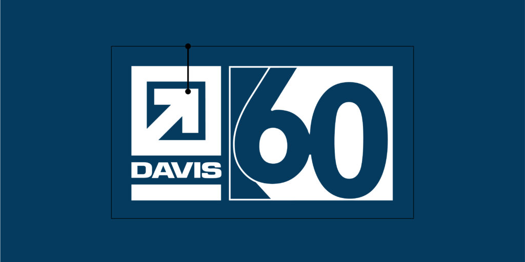
The final identity extends the established DAVIS typemark into a distinct 60th anniversary mark. Rather than creating a separate commemorative logo, the "60" was developed as part of the existing typographic language, allowing the anniversary identity to remain recognizable while introducing a new visual expression for the milestone.


Primary & Secondary lockups
Two lockups were developed to give the anniversary identity flexibility across different applications. The primary configuration places the anniversary mark alongside the DAVIS typemark for prominent brand communications, while the secondary configuration allows the identity to adapt to narrower or more constrained formats.
typography
Gill Sans Nova was selected as the primary typeface for its contemporary geometric character and strong legibility. Eurostile provides a complementary technical quality, reinforcing the construction-oriented nature of the brand while creating contrast within the system.
Color
The color palette builds from DAVIS's established visual language, using blue as the dominant brand color and a lime accent to create contrast and emphasis throughout the anniversary system.
Design system
The identity was extended beyond the anniversary mark through a flexible set of graphic devices, including directional arrows, the 1966 date, typemark configurations, color relationships, and supporting imagery. These elements were designed to work independently or together depending on the application.


GRAPHIC LANGUAGE
The geometric construction of the anniversary mark became the foundation for the supporting graphic language. Directional forms, angular shapes, and repeated typographic elements extend the visual character of the "60" across the identity, creating consistency without requiring the logo to appear in every application.
Layout & Application
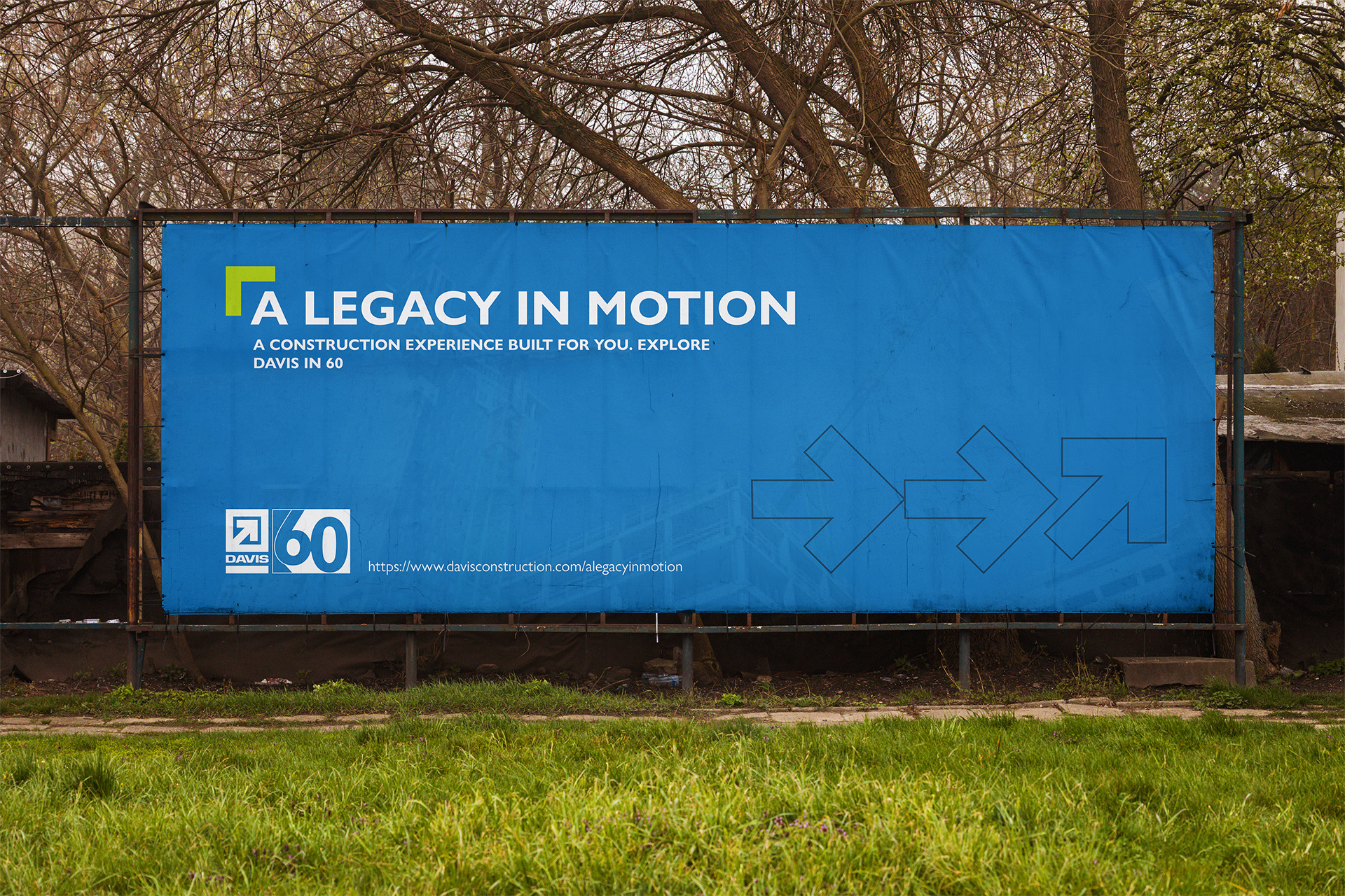
The visual system was designed to adapt across different formats while maintaining a consistent sense of hierarchy. Large typographic elements, strong color fields, and geometric forms create recognizable compositions that can scale from digital communications to physical and environmental applications.
Applications
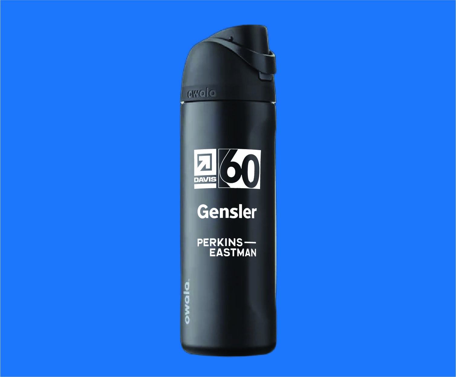
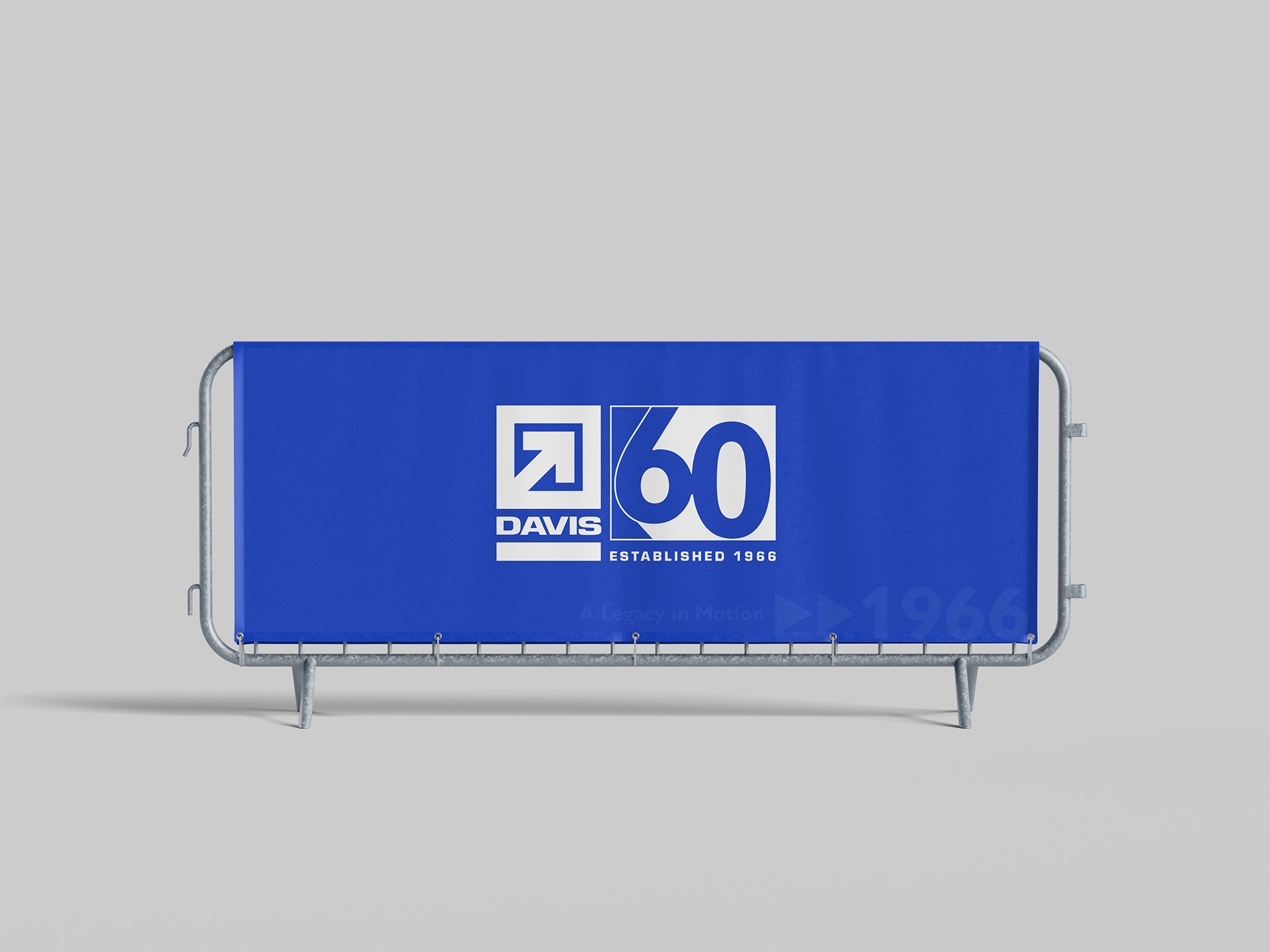
The completed identity was designed to function across the range of touchpoints associated with the anniversary campaign. From digital communications and promotional materials to environmental applications, the system allows DAVIS to maintain a consistent identity while adapting to the needs of each format.

RESULTS
The resulting anniversary identity gives DAVIS a flexible system for celebrating 60 years while maintaining continuity with the established brand. By integrating the anniversary directly into the DAVIS typemark, the identity can communicate the significance of the milestone without creating a separate visual identity disconnected from the broader organization.
DELIVERABLES
Anniversary identity · Typemark system · Typography · Color palette · Graphic language · Digital applications · Environmental graphics
takeaways
This project reinforced the importance of evolving an established brand without compromising the recognition it has built over time. The anniversary provided an opportunity to introduce new visual elements, but the strongest direction came from treating the existing DAVIS identity as a foundation rather than something that needed to be replaced.
Developing the identity across multiple applications also emphasized the importance of creating a system that can adapt beyond the initial logo. The final direction was built to support the anniversary campaign while remaining consistent with the larger "One DAVIS" brand philosophy.