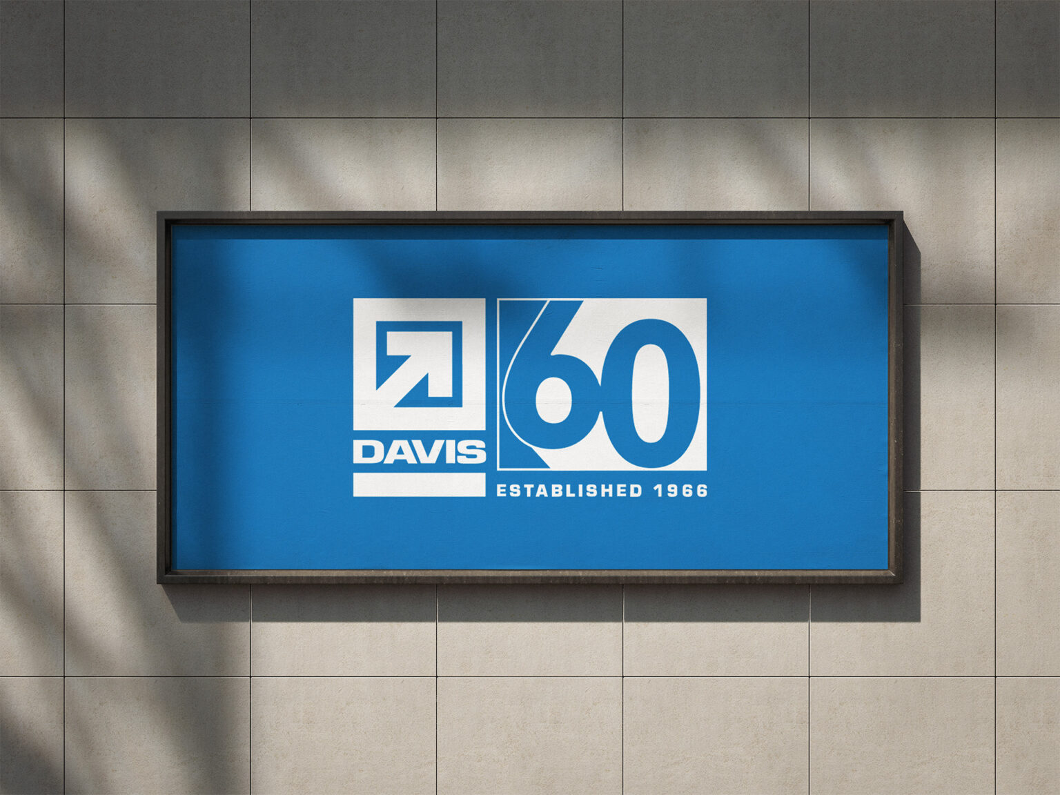
DAVIS CONSTRUCTION
Overview
Role:
Brand Designer
Contribution:
Identity & System development
Visual direction, Applications, Guidelines
For its 60th anniversary, DAVIS needed an identity that celebrated six decades of history without losing the recognition of its established brand. The system also needed to scale beyond the DMV as the company expanded into new markets.
Strategy
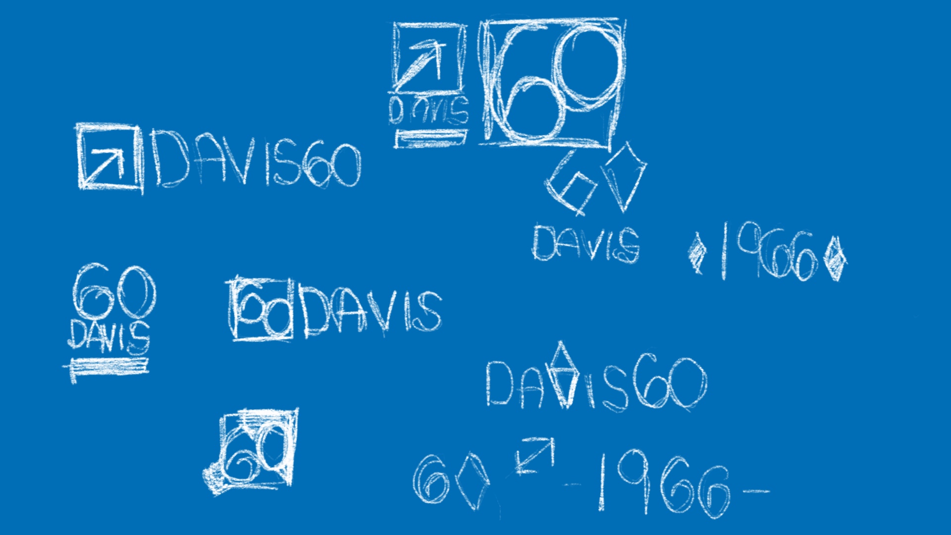
PRESERVE BRAND EQUITY
DAVIS had built six decades of recognition throughout the DMV area. Rather than replace the existing typemark, the anniversary identity extended familiar brand elements to create something new while remaining immediately recognizable.
Build Around 60
The “60” became the central design feature of the anniversary identity. It extended the DAVIS typemark while giving the anniversary milestone its own presence. The system was designed to remain familiar as DAVIS expanded into new markets with the goal of reinforcing a “One DAVIS” identity across locations.
Balance Legacy + Progress
The visual language paired established DAVIS brand cues with bold typography and geometric forms, giving the anniversary a contemporary, celebratory presence without losing the confidence of the core identity.
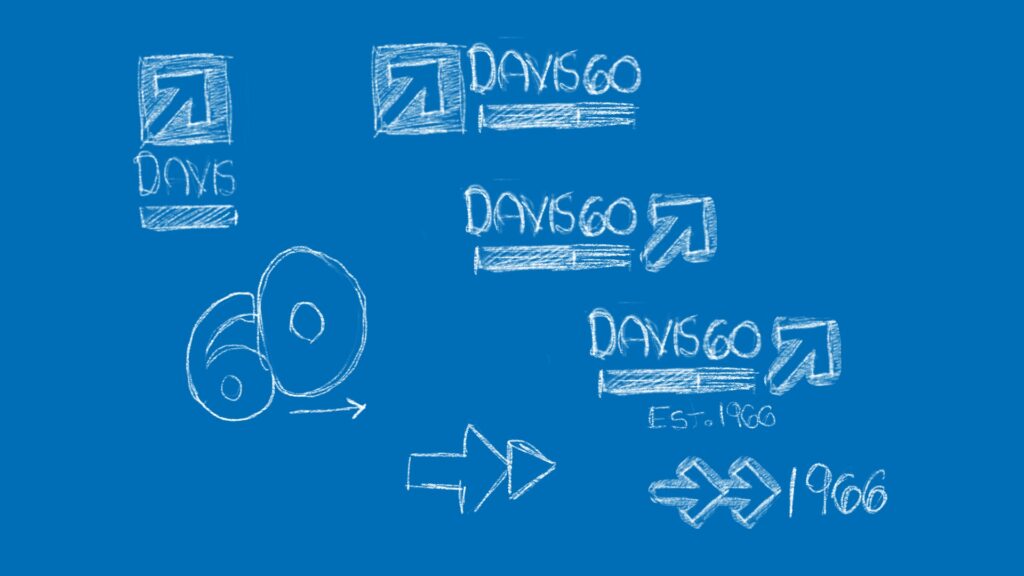
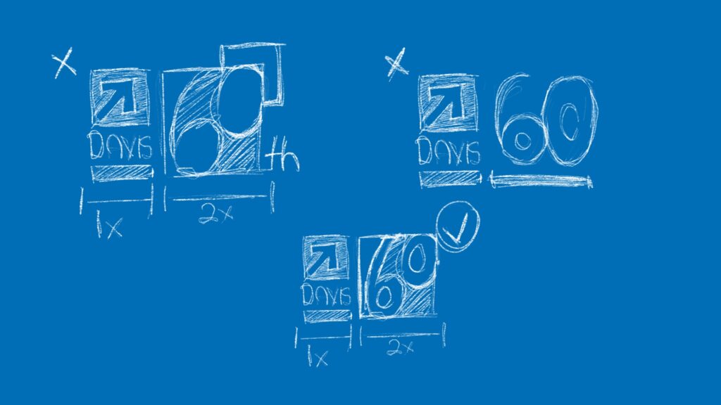
EXploration
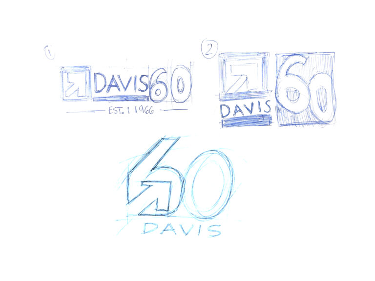
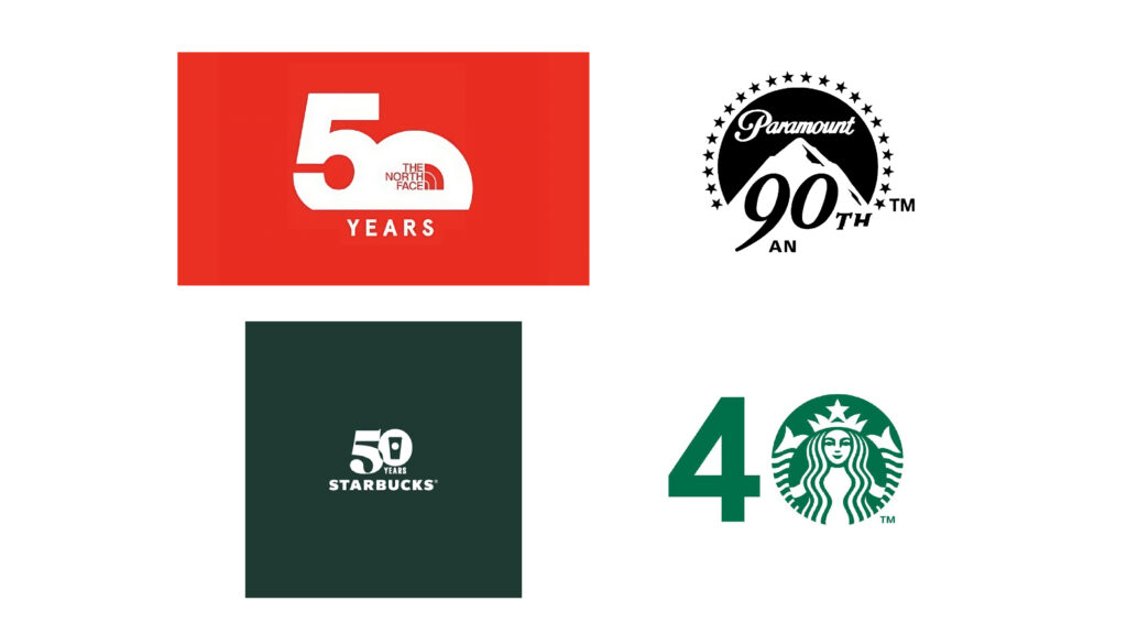
IDENTITY
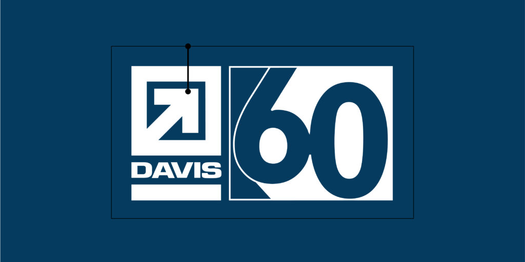
The final identity extends the established DAVIS typemark into a distinct 60th anniversary mark. Rather than creating a separate commemorative logo, the "60" was developed as part of the existing typographic language, allowing the anniversary identity to remain recognizable while introducing a new visual expression for the milestone.


Primary & Secondary lockups
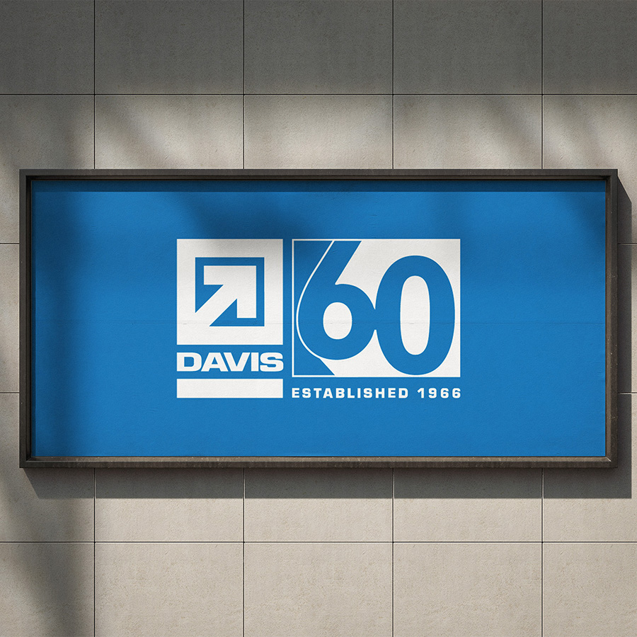
Two lockups were developed to give the anniversary identity flexibility across different applications. The primary configuration places the anniversary mark alongside the DAVIS typemark for prominent brand communications, while the secondary configuration allows the identity to adapt to narrower or more constrained formats.
typography
Gill Sans Nova carries the established DAVIS brand voice through its humanist proportions and strong legibility. Eurostile introduces a complementary technical quality that reinforces the construction-oriented character of the system.
Color
The color palette builds from DAVIS's established visual language, using blue as the dominant brand color and a lime accent to create contrast and emphasis throughout the anniversary system.
Visual System & Guidelines
The identity was extended beyond the anniversary mark through a flexible set of graphic devices, including directional arrows, the 1966 date, typemark configurations, color relationships, and supporting imagery. These elements were designed to work independently or together depending on the application.
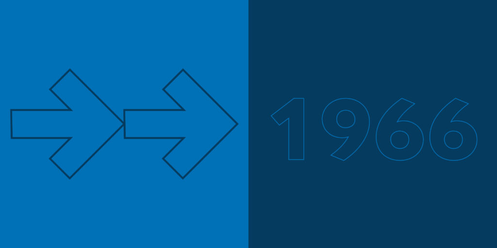

GRAPHIC LANGUAGE
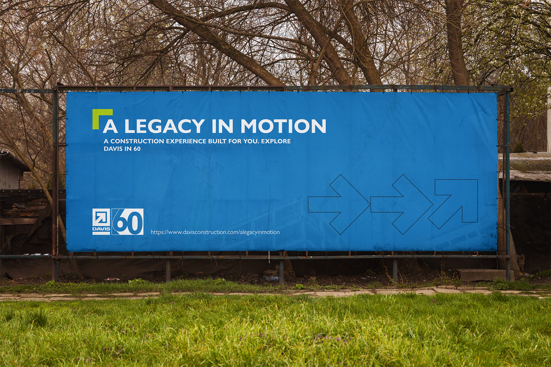
The geometric construction of the anniversary mark became the foundation for the supporting graphic language. Directional forms, angular shapes, and repeated typographic elements extend the visual character of the "60" across the identity, creating consistency without requiring the logo to appear in every application.
Layout & Application
The visual system was designed to adapt across different formats while maintaining a consistent sense of hierarchy. Large typographic elements, strong color fields, and geometric forms create recognizable compositions that can scale from digital communications to physical and environmental applications.
Applications
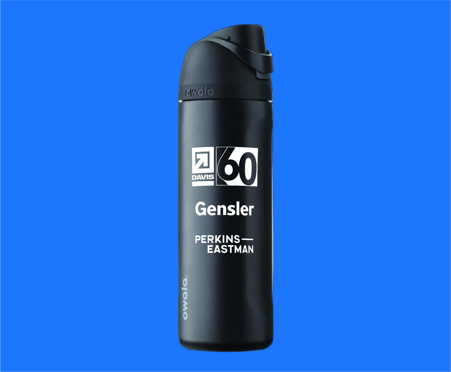
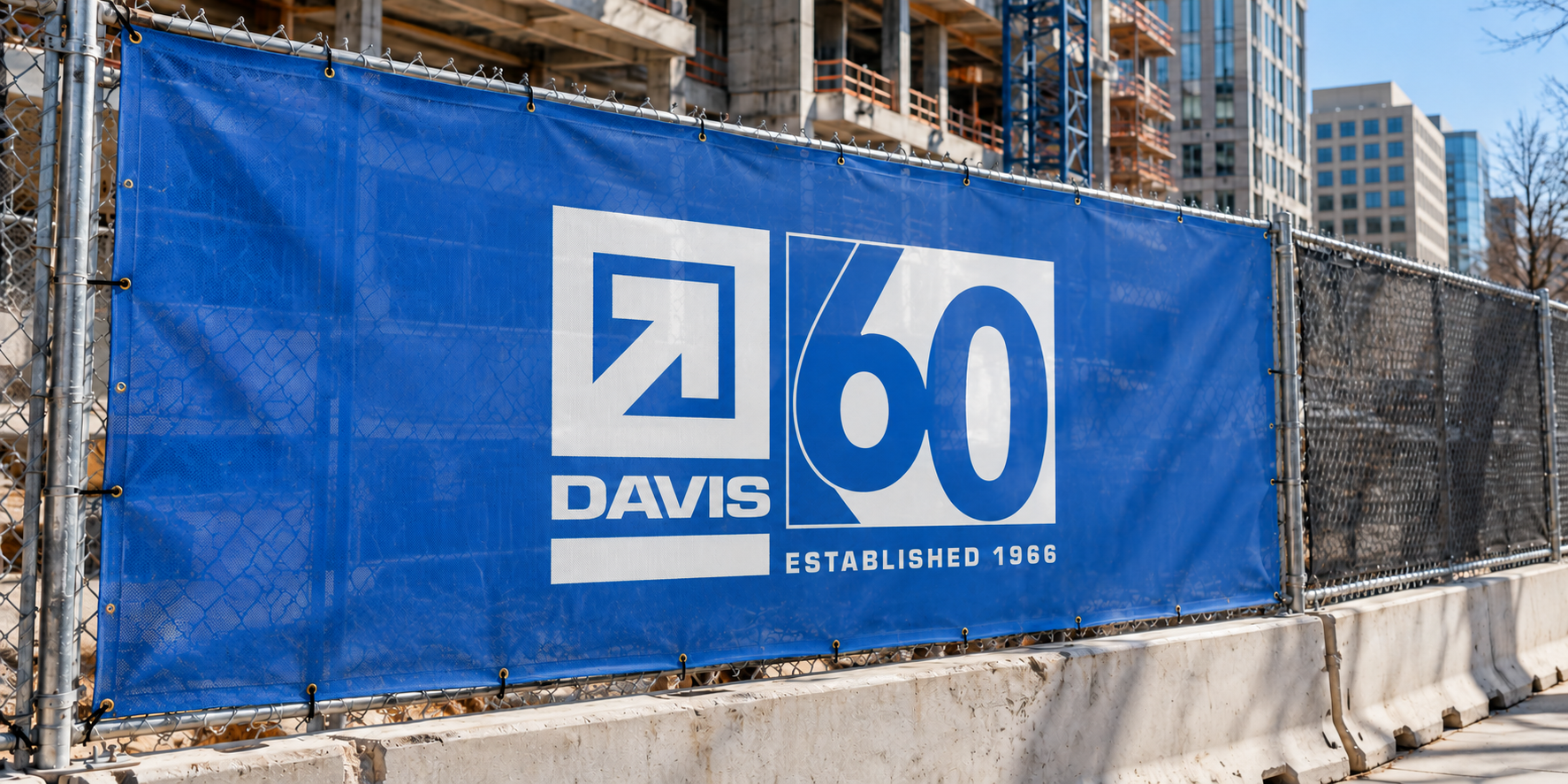
The completed identity was designed to function across the range of touchpoints associated with the anniversary campaign. From digital communications and promotional materials to environmental applications, the system allows DAVIS to maintain a consistent identity while adapting to the needs of each format.
Impact & Deployment
The anniversary system was used across print, digital, promotional and environmental applications, supported by documented lockups, typography, color and graphic standards. I coordinated production across branded signage and promotional materials with internal stakeholders and external vendors to maintain consistent execution.
DELIVERABLES
Anniversary identity · Typemark system · Typography · Color palette · Graphic language · Digital applications
Environmental graphics · Guidelines